Oregon Episcopal School
Reimagining a school brand to reflect its spirit, strength and vision

About the School
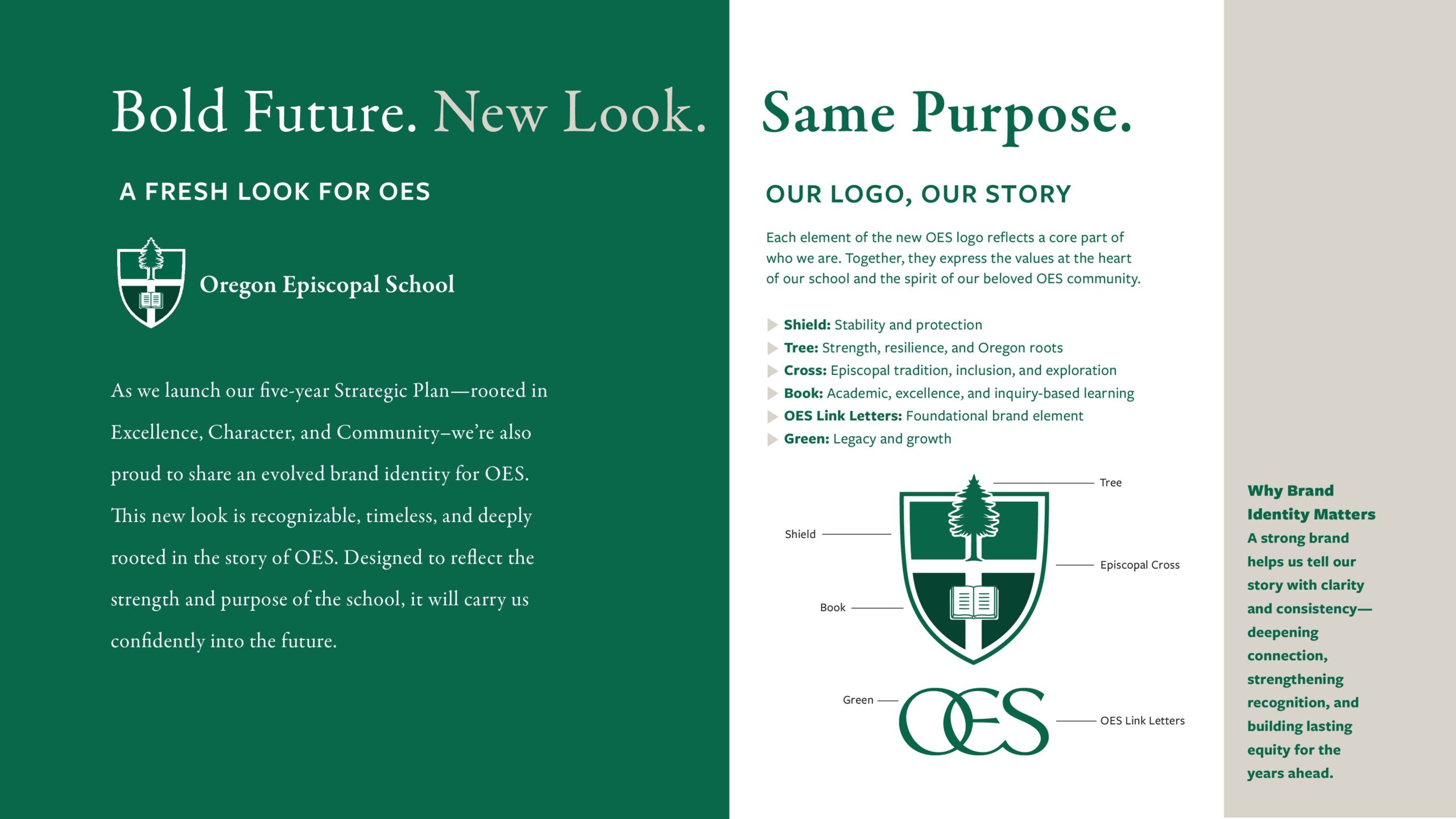
Oregon Episcopal School (OES) is one of the Pacific Northwest’s most respected independent schools. The sprawling campus is home to a thriving community of day and boarding students from pre-K through 12th grade. With a nearly 160-year legacy and a bold new Strategic Plan, OES leadership recognized it was time for the school’s messaging and visual identity to match its ambition. They turned to Weinstein PR to help translate vision into design – and to build a brand that will endure.
")

The Challenge
WPR undertook a full visual brand evolution – one that would honor the school’s Episcopal roots and academic excellence while positioning it for what’s next. The effort was timed to coincide with major institutional milestones, including the community-wide launch of their new five-year Strategic Plan and the unveiling of a new website.
School leaders were clear: They wanted a streamlined brand identity system that felt clean, crisp and collegiate.
The Goal and Strategy
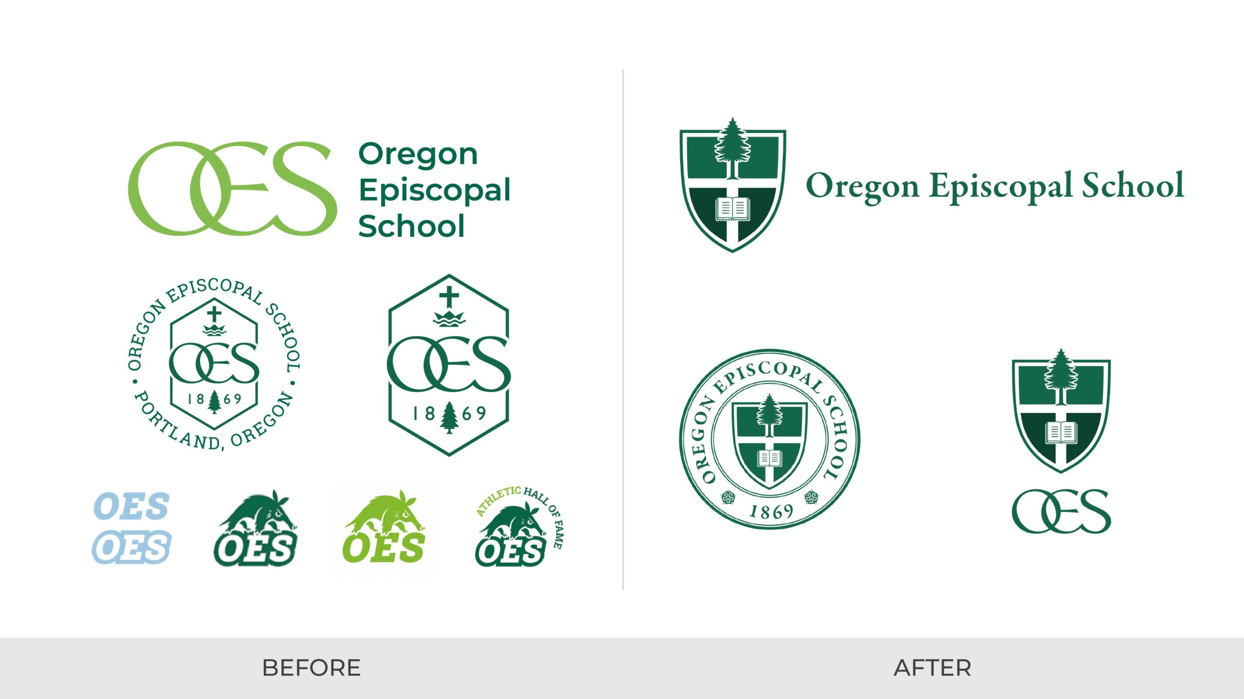
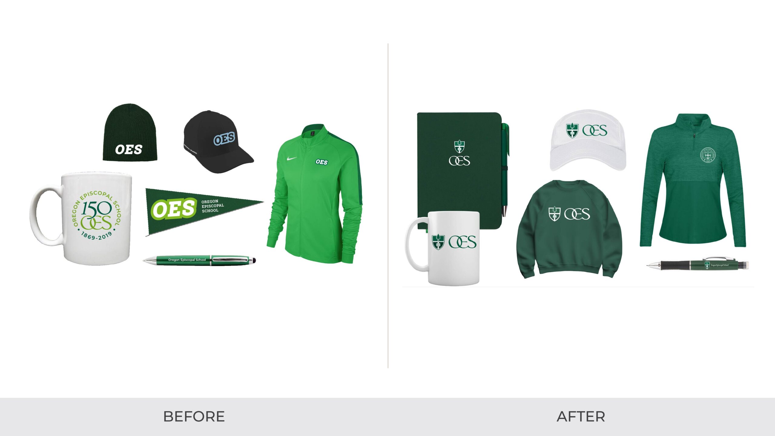
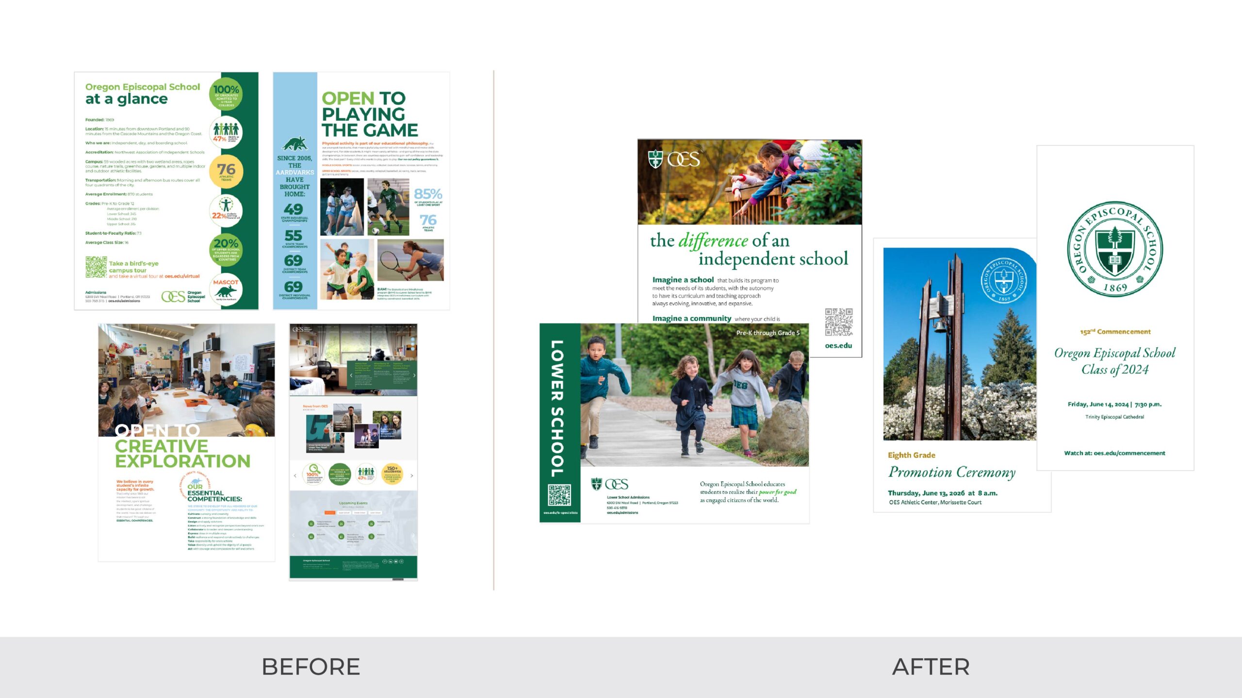
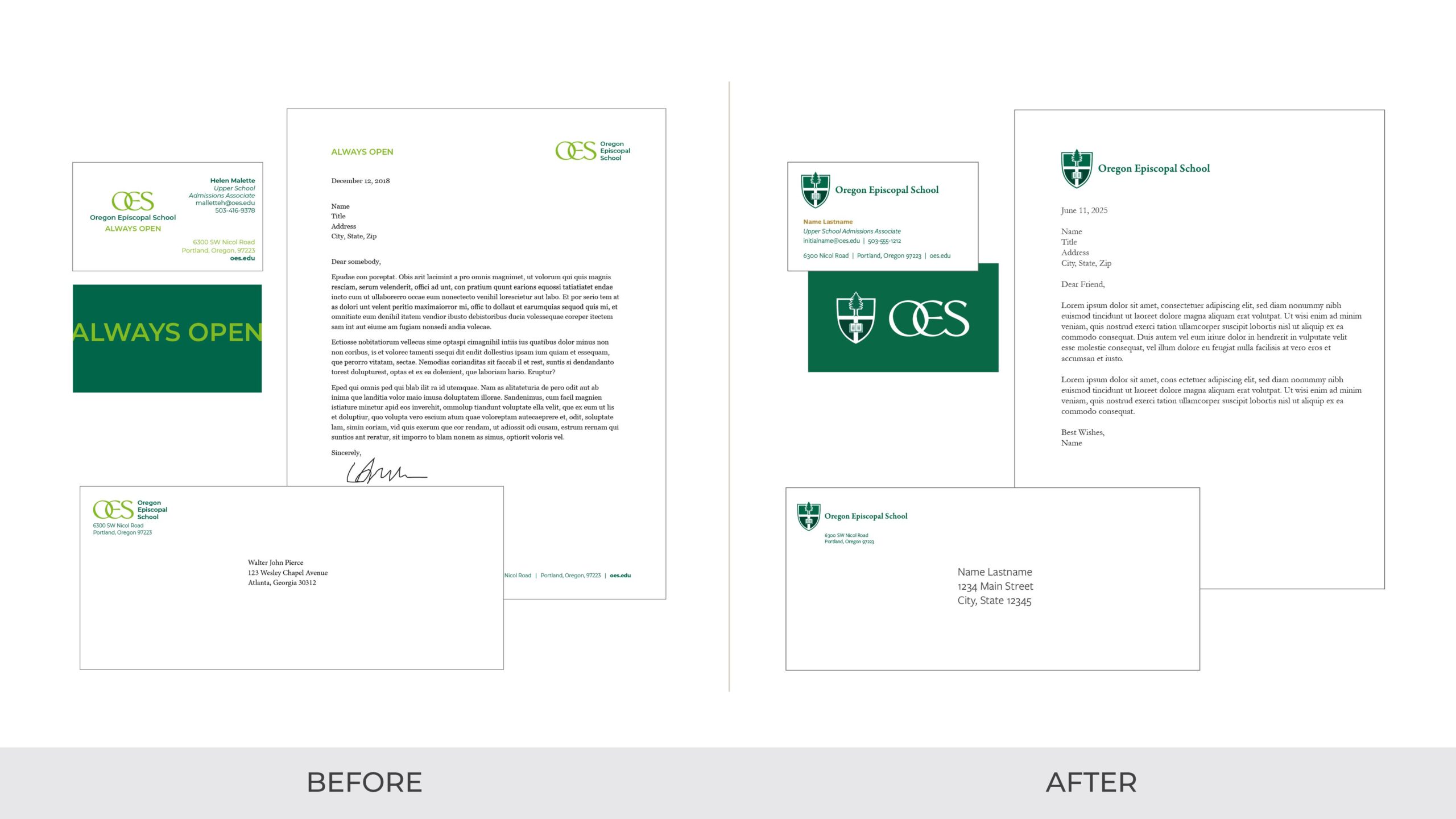
WPR began with a robust discovery phase, reviewing past brand work, leading stakeholder interviews and conducting a competitive audit of peer schools. One early insight? A secondary color meant for occasional use had drifted into primary territory, and Aardy the Aardvark — undeniably cute and easy to reach for — had become so visually prominent that he often overshadowed the core institutional brand.
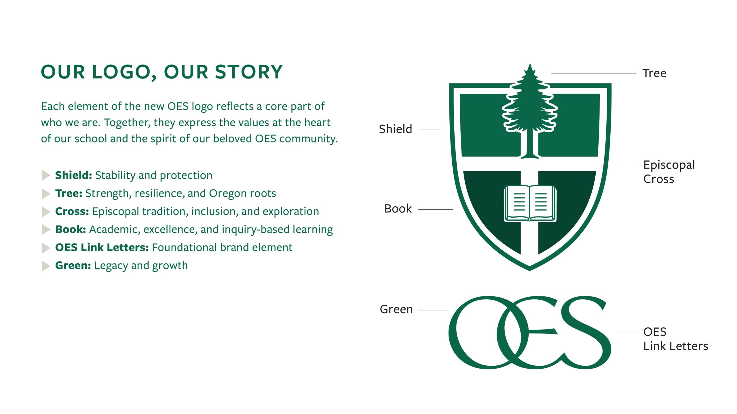
We then distilled the brand to its most recognized elements: the iconic OES link letters – originally designed in the 1970s by local artist Inga Dubay – with defining interlocking letters, and the OES Green. We then designed a refreshed logo suite anchored in a shield and layered with purposeful symbols: a tree for Oregon roots and resilience, a cross for Episcopal tradition and inclusion, and a book for academic excellence.
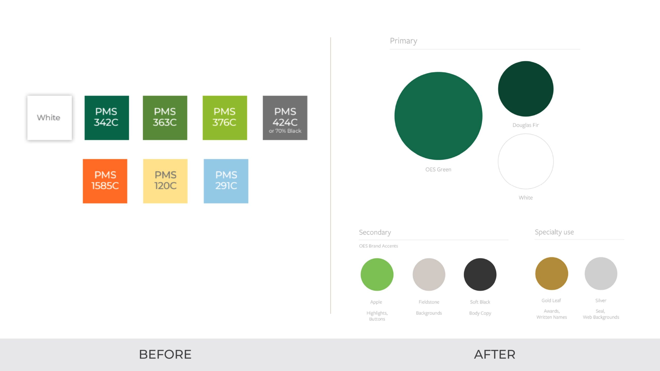
The color system was streamlined so the OES Green could lead the way, supported by a deeper forest tone and white, with secondary colors restricted to accent use only.
Finally, we established a timeless font pairing: Garamond to convey heritage and strength, and Freight Sans Pro to bring modern clarity. Together, the system was designed to unify, simplify, and give OES a brand that reflects both its history and its vision for the future.
 copy")
The Results:
The refreshed brand debuted in fall 2025 and was quickly adopted across admissions, advancement, campus signage, alumni communications and merchandise. The new visual identity struck the balance OES was seeking: tradition and clarity with a modern edge. It reestablished consistency, grounded the school in its values, and gave its internal teams the tools it needed to communicate with confidence. Most importantly, the school’s look finally matched its vision.
Weinstein PR was the ideal partner for this work – thoughtful, strategic, and deeply attuned to the nuances of independent school culture. They helped us uncover the essence of OES and express it in a way that feels both timeless and future-focused.”
The Rev. Michael Spencer, Head of School, Oregon Episcopal School
